
The original default payment page had not been updated for many years and was long overdue with needed changes. Known issues including usability, outdated look and feel and mobile responsiveness. With a new API being built, it was an opportunity to create a new default payment page. As a global company, Ingenico also provided differing payment pages for the SMB and Global Online entities, and our two teams decided that only one Ingenico default payment page was needed that could be provided as a shared service.
My main roles on the project was to redesign the default payment page and conduct user research on the design. I was also the main visual designer.
Over the course of 6 months, we jointly worked on the designs and organized the research sessions. First, we conducted remote usability testing on existing merchant payment pages and conducted desk research on existing best practices.
After two rounds of design, we tested an interactive prototype with 5 users in a UX lab in Amsterdam with a team of observers. We learned the order preference of buttons, how users like to navigate through a page and how important seeing payment logos are. We then held a design workshop with stakeholders from both Belgium and Netherlands office where we shared the research findings and held co-design activities to create new ideas and determine the design direction. We also worked with a UX writer to ensure we use easy to understand language for all the text and error validation messages.
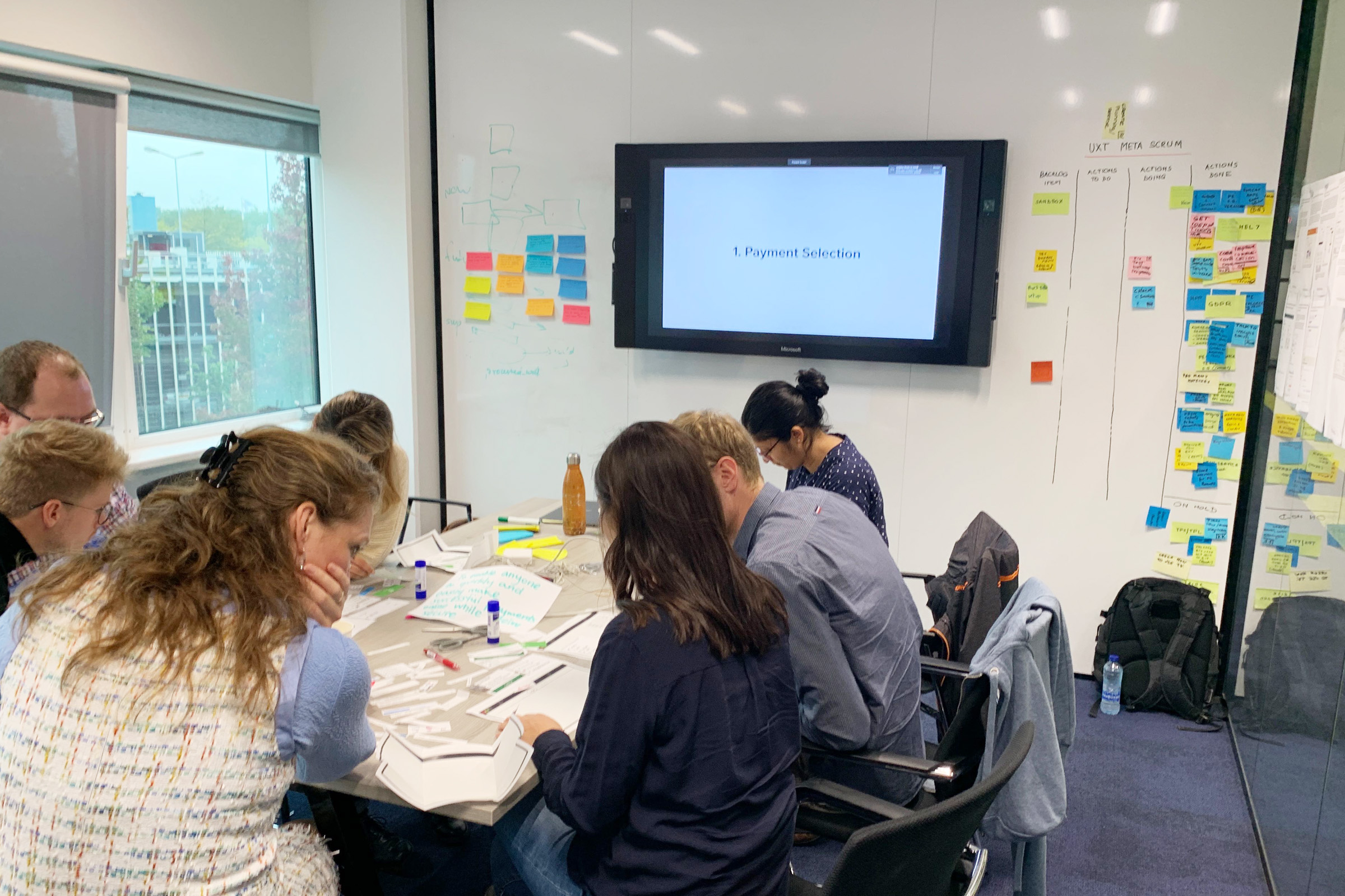
We translated the design inputs into two different prototpes that tested various ideas such as the Drop-In UI, icons with text and payment selection pages. Using TestBirds, we ran tests with 12 users from different countries who completed remote usability videos. We analyzed the findings and found many interesting insights such as how people prefer to navigate the pay button and how important the order summary was for users.
Another aspect of the design was to ensure the new default payment page would be WCAG compliant so that anyone can use the page to complete their purchases. As our merchant's end users have some older and visually impaired users, this was important for us to achieve.
The final round of designs included usability testing with colour blind and users with low vision. We were able to better understand what elements work well for them such as pairing icons with text in the confirmation pages.
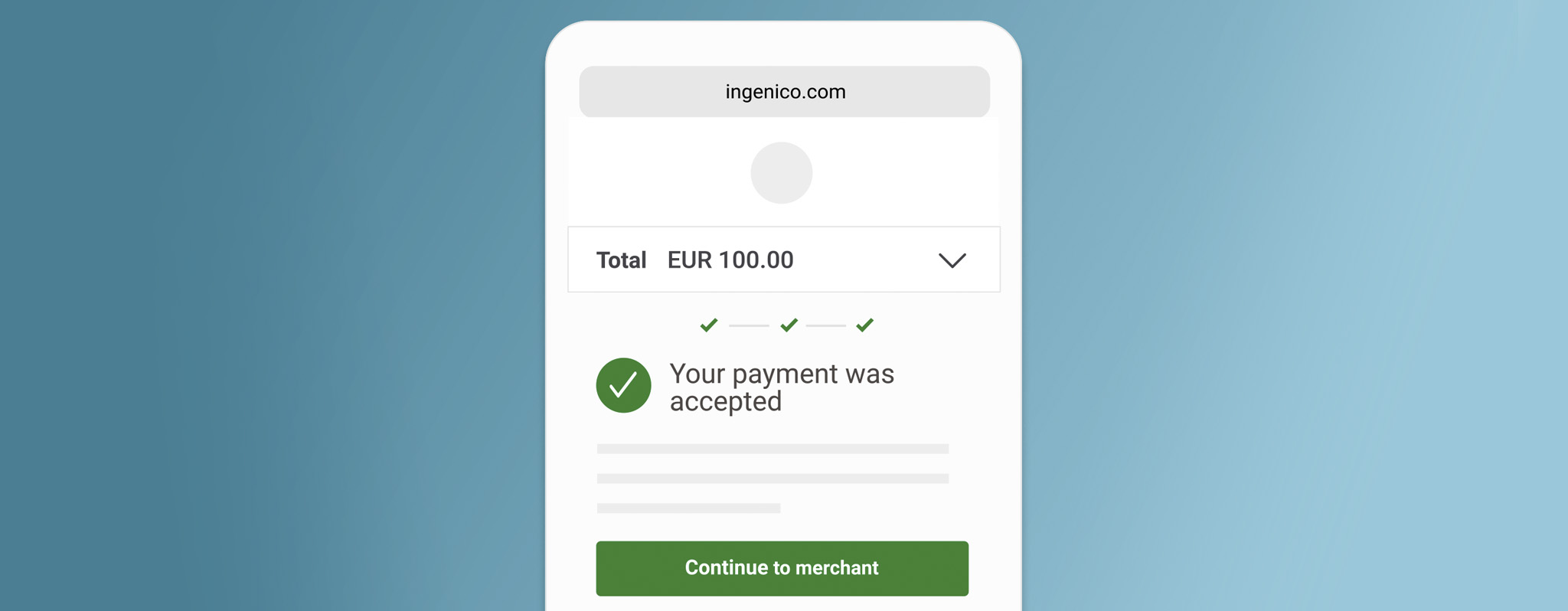
The final outcome was a WCAG level A compliant payment page with more accessible and intuitive interactions that could be used across both Ingenico entities and that was easy to complete for all the users we tested with. We also gained a lot of useful insights on payment page best practices and user interactions from the 40+ users we tested with. I also shared the research findings widely across Ingenico and created guides that would help our merchants, sales and technical consultants to use our default payment page more effectively or to build even better custom payment pages.
– Participant with low vision
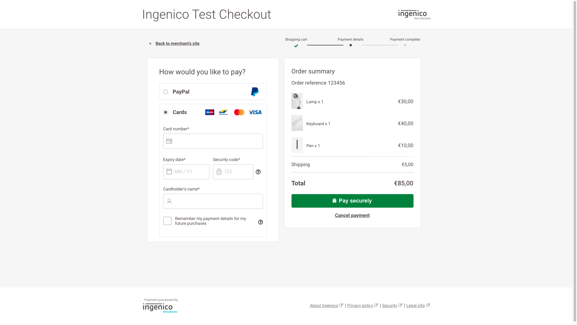
Payment Page Design with in-line layout
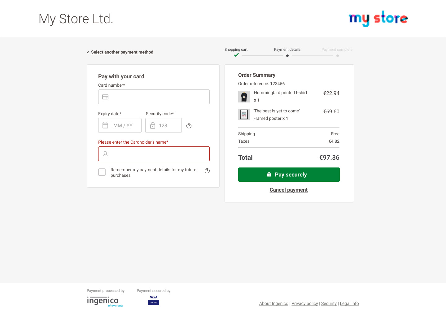
Using plain language for error validations
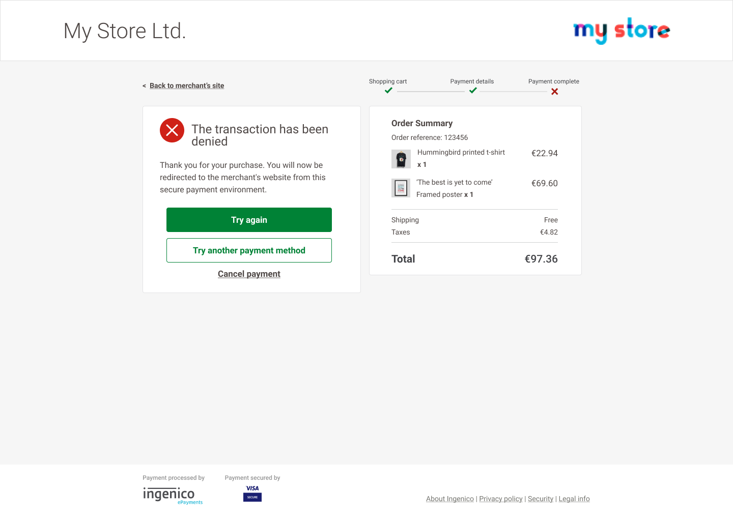
Considering failed payments in the design
© Marie Cheung


